M farms
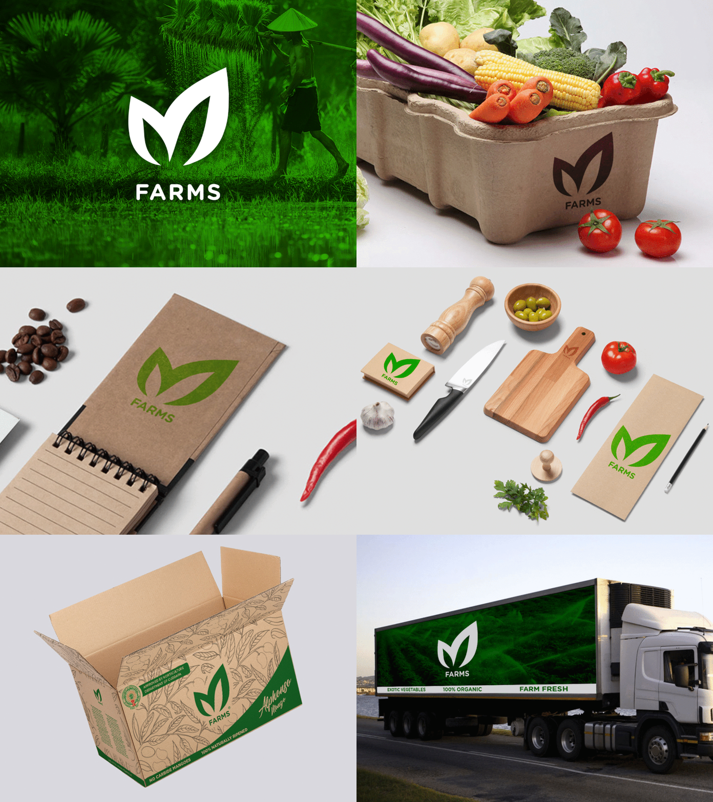
M Farms is a agritech Startup with a mission to make fresh fruits & vegetables accessible to everyone. I started working with the founders when M Farms was just an idea and developed a visual identity that would stand on its own.
01
Visual Identity
With the aim of creating a simple, bold and memorable symbol that was familiar and immediately recognizable, the Leaves have a particular relevance to the brand's fresh products.
01
Visual Identity
With the aim of creating a simple, bold and memorable symbol that was familiar and immediately recognizable, the Leaves have a particular relevance to the brand's fresh products.
02
Logo Design
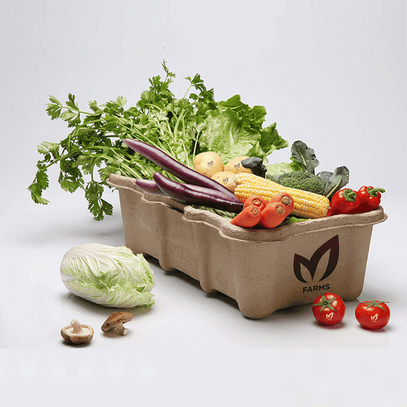
With that as starting point, I created the "M" monogram that appears as a leaf and M alphabetCreated a visual language that reinforced the brand with a strong single color palette.

03
Competitive Analysis
I conducted a competitive analysis of existing products some of which are Binance and Xend Finance, two of the top players in the African market.
Strengths
Binance has deep pockets and can provide liquidity to its DeFi projects,
Low transaction fees
Established reputation and user base
Weaknesses
It can be overwhelming for new users, with a lot of features and options that may be difficult to navigate
Confusing terminology and jargon
Finally, Binance's customer support can be slow to respond, which can be frustrating for users who need help with issues.

04
Result
The user flow highlights the different pathways a user can take when trying to navigate Huzl app. The app employs a simple and straightforward navigation system that allows users to move effortlessly between different sections and features, ensuring a smooth and enjoyable user experience.